Showing posts with label ombre. Show all posts

March 16, 2014

Pinspiration Sunday

Post #100!

Wow, I nearly missed noticing it but this is officially the 100th post!  Furthermore, I've ticked over 9000 page views since this little blog started last summer.  Not too shabby, if I dare say so myself.  And of course, a big thank you to all of you who pop by to read, comment and share in my hobbies and snippets of life.  Now, go grab your hot beverage of choice and we'll get the day officially started with some photo love.

Currently:

* listening - radio
* reading - catching myself up on quilting & papercrafting magazines
* making - layer cake sampler quilt-along
* eating - nothing yet; brunch soon
* drinking - water
* wearing - PJs & cardie
* weather - rainy, 8C
* feeling - hungry
* wanting - to sew, sew, sew!
* needing - to book tickets to Ireland & hostel
* planning - belated Shrove Tuesday (AKA Pancake Day) supper with friends
* thinking - what to do today...
* loving - new fabrics
* enjoying -  lazy Sunday morning in bed

And now on to the pins:

It's chevron, it's turquoise and it's ombre - swoon!  No actual pattern (just HST, after all) but great inspiration and some tips for best effect.
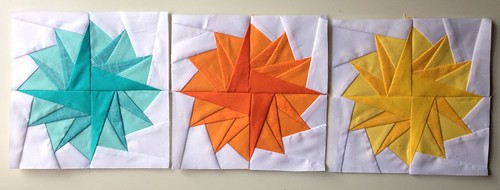
Remember that circle of flying geese pattern I mentioned for my Persian Pickle Project?  Well, take the same paper piecing pattern and make pompoms!

Here's another handy guide for starting free motion quilting, focusing on steps to prepare your machine for the project.

I've been meaning to make a small one of these for ages to put cutlery into when going to quilt guild.  Don't limit yourself just to cutlery, though - you could use these for many different items and adjust the pocket sizes as needed.

I always love Jill's work and these artsy pie charts are such fun!  A nice way to break out of the traditional scrapbooking format and have some fun with scraps, too.
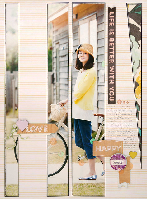
Here's another interesting idea for those of you who want more inspiration for using photo enlargements.  Sandy has cut large slits into her background paper and adhered the photo to the back so that sections peek through to the front - neat visual interest.  I also really like the black doodle lines around each window.

Okay, let me preface this by saying that green is my least favourite colour.  However, this colour palette is just gorgeous!  The mix of limes, turquoise and an unexpected lavender is very refreshing and spring-like.  Love it.

And finally, I stumbled over this adorable quilter's rendition of the 'Soft Kitty' song from Big Band Theory (total fangirl).  Yup, just awesome.

February 22, 2014

An Elf's Work is NEVER Easy

I have a second LO I worked on the other day during my crop with Anya.  I decided to knuckle down and tackle my Christmas photos again.  Before we get to the LO goodies, I do have a little review of my thoughts on this year's collection choice.

As I mentioned in a previous post, I was struggling with using the Reflections Christmas collection I bought for my 2013 Christmas series.  A large part of this difficulty I realised, was due to the majority of the papers either being very bold text prints or dark/busy patterns that don't work well with journaling directly onto the background papers.  As a result, I've had to mix in a lot more patterned paper from other collections, which is fine but I really enjoyed just sticking to the one collection last year.

I've also noticed that the Reflections Christmas has two different values of red, which don't really go well together - especially the red letter stickers with the crimson patterned paper.  That's been a bit disappointing so I've been resorting to other letter stickers and Thickers, which again is fine but shouldn't have to be the case and using just those that typically come with the collection helps retain unity across different pages in a series.

My final critique of Reflections Christmas is that the sticker sheet isn't as versatile as last year's.  There are a lot of repetitive tags/banners that say 'Christmas'; more than necessary, IMO - and yet not enough shaped element stickers.  There also seem to be significantly more large stickers (again, large tags or banners), so that overall there are fewer stickers on the sheet.  I find myself looking over the options feeling like I'm missing something when I get to embellishing.

Now, don't get me wrong - I love Echo Park collections and Lori Whitlock's in particular!  But I don't feel that this specific collection was thought through thoroughly enough in these regards.  It's still a beautiful collection, but it needs a little tweeking.


Okay, on to the LO!  This is a little story about the balancing act that is being the Christmas Elf who hands out the gifts on Christmas Day.  I added in a 6x6 paper from Dear Lizzy's Lucky Charm for the journaling block.


Most of the embellishments are from the sticker sheet, although I also worked in an OA label sticker, Crate Paper border sticker (The Pier browns work really nicely with Reflections Christmas) and some Fancy Pants cork embellishments.  I also used some pretty red rhinestones I picked up from the local craft shop - I had been thinking of using enamel dots but Christmas requires some special sparkle.


For the title, I opted for Crate Paper's Funkydori Thickers.  Even though the word 'never' is all in captials, I wanted it to stand out a little more and have some extra special treatment so I used my brown distress ink and applicator to give it an ombre effect.


And here you can see those luscious red rhinestones and some of the fun twine twisted around the corner.  I also wanted to add in some wax seals.  I used to seal all of my handmade Christmas card envelopes with wax seals a number of years ago, but it takes a long time when you're doing 50 or so cards so I sort of slowly stopped doing it but I love the look and thought it would be a nice addition to my LOs.

July 15, 2013

Summer on the Horizon

I feel like I've sewn my brains out these last few days (not a bad thing, just saying) so I'm switching gears back to scrapbooking.  I've had one partially started layout sitting on my table for far too long for my liking and while I wanted to get it finished over the weekend, that didn't happen but today was the day - hurrah!

So for this layout I tried something different from what I normally do.  Using colour palette charts seems to be all the rage in scrapbooking lately and I do love the Design Seeds palettes so when I saw this one, I knew I had to use it - orange, yellow and turquoise - *happy place*...


I pulled entirely too much paper and 'stuff', which resulted in being overcome with choice - never a good thing for me.  I worked on whittling it down, thinking I knew what I wanted to make and in the end it went in a rather different direction - different but good.  Here's the final layout:


I made the sun burst from vellum, which I misted in a bright orange, then cut out the rays and stitched them down with my sewing machine.  For the sun itself, I painted a doily using the same orange mist.


For the water I layered up stripes of different turquoise papers in an ombre effect and tilted them here and there like moving waves.  Then I layered up some turquoise sewing thread over top for some texture and held it in place with pearls for 'sea spray'.


I kept the few embellishment clusters small because I really pushed myself to go into excess on the rest of the page - something that is hard for me to do but I really wanted that boldness and overpowering feeling of joy that a multitude of gold sequins gives (or is that just me?).  And that adorable butterfly shaped paper clip?  I found that at an art/stationery shop in Ystad the other week - sooo cute!

Lastly, I used this page to play around with some homemade texture paste (talcum powder, glue, paint and a bit of water) and I'm really pleased with how it turned out.  I cut my own triangle mask from some cereal box cardboard to use with it.  Easy peasy.


Feels good to get this project completed and I feel like I've stretched myself with some fun, new or different techniques.

July 10, 2013

WIP Wednesday

Here we are at another Wednesday - seriously, how do they fly by so quickly?

The wind today is really whipping outside and been making me feel restless but I have managed to putter around with some scrapbooking today.  While I generally consider most layouts 'finished' once they're off my work table and photographed, sometimes I'll look at one I've done recently and realise that there's something missing.  I'm quite happy to go back and tweak as necessary in these situations, because I'm a firm believer that I should be happy with my creative work.

So today I pulled out this layout that I created in April:


After I finished it, something just felt missing so I kept it out to mull over what it was and how to ultimately finish it.  I felt like I wanted to frame the photo and that with all the delicate colours, it needed something dark to help anchor it.  I also felt that with all the straight lines in the design and the papers, it needed something circular beyond just the buttons and the sticker.  Then I remembered one of Shimelle's older sketches (here), that uses brads in a circular shape.  So today I broke out a package of alpha brads I've been hoarding and got to work; I filled out the rest of the circle with gold sequins (totally obsessed, it's a sickness, really).  For me I found a tighter circle worked best.  After:


And a detail shot:


I feel confident in calling this project done now and have slipped it into its album.

Then I decided to work a bit more on a layout I started the other week with a sun and surf theme.  I discovered, however, that the recent humidity, low as it was, curled my vellum so I'm trying to press it out, as it's making the layout a bit tricky to work with curled up.  I did, however, add the bottom layer of papers today:


By that time I'd lost steam so I've put it aside again to flatten out some.  I am hoping to finish it off by the end of the week, though, since I don't usually leave pages to sit like this; I'm more of a start to finish scrapper normally.

I'd also like to take a moment to thank the people over at Quilter Blogs for linking to my blog.  They have a lovely selection of quilting and sewing related blogs so if you also love stitching, please do check them out.

QuilterBlogs

June 30, 2013

Pinspiration Sunday

Hello, everyone!  My apologies for being MIA the last few days.  As I mentioned in my previous Sunday post, my favourite computer game, The Sims, released a new game - The Sims 3 Island Paradise - last Thursday and I've been glued to my laptop playing that (awesome - totally recommend if you're a fellow Simmer!).  Here's a little peek at what I've been up to in-game:

Mermaid Rajan and his adorable toddler mermaid daughter, Coral - so cute!

Right, back on topic.  Go grab your hot beverage of choice and enjoy some photo love.

Currently:
listening - Mix Megapol Top 20 (Sarah Larson)
making - stuffed 'chooks'
wearing - PJS
weather - windy & rainy, 13C (totally depressing)
feeling - hungry
wanting - summer weather & temperatures
needing - to catch up watching 2Peas videos
planning - what to pack to visit friends at their cottage
thinking - I should be glued to the laptop less
loving - playing The Sims 3 Island Paradise
enjoying - having cold running water during daytime hours again (plumbing construction)

I've had these gorgeous citrus felt coasters bookmarked for years now and still haven't made them but I have decided I'm going to change that!  I've finally bought the felt and I'm going to take it with me to the cottage later this week and start stitching.

Another great take on the ombre trend - paint chip placemats (complete with embroidered paint colour names, even!) - love 'em!  I can totally see these in my kitchen and they'd be super quick and easy to sew up.  These versions use the solid ombre fabrics from Moda Fabrics but you could substitute broadcloth in four shades if necessary.  Or, if you're really adventurous, hand dye the broadcloth yourself!

And here's another fun sewing/scrapbooking cross-over: washi fabrics!  A number of online retailers sell this collection online; just Google it if you're interested.

This site is really neat, and having just finished watching the latest episode of Glitter Girl 76: Not Just Geography, perhaps you're looking for a way of incorporating maps into your next project?  Well, this site could help - enter a location, choose a map filter and viola!  Instant map that you can print and use, either with your home printer to make custom map papers or why not print as a photo enlargement to really give your scrapbooking page POW!  The watercolour filter is especially lovely.

There are so many great little details about this grid page by Tonya for the MME blog.  I really love how she ran the journaling around the box and used tiny number stickers to match up the list items with the photos.  I also really liked her use of the black postage stamp-edged mats under the photos and the enamel dots in the grid joins.

I also really liked this page by Nicole Samuels on the SC blog.  I'm one of those scrappers that often holds onto even the tiniest scraps of paper (and actually uses them!) so the idea of using these thin paper strips to make a woven-type frame is right up my alley.

And finally, a bit of colour palette inspiration for you.  These soft, delicate pastels just made my heart swoon.  If you use this palette, I would love to see what you do with it!

So, what's been inspiring you this week?  Enjoy your Sunday!